https://github.com/leedrake5/Russia-Ukraine
Using data from Oryx’s site, I’ve put together a quick tracker to visualize equipment losses since Russia’s February 24th invasion of Ukraine. This is only equipment that is independently verified, as noted by Oryx:
This list only includes destroyed vehicles and equipment of which photo or videographic evidence is available. Therefore, the amount of equipment destroyed is significantly higher than recorded here. Small arms, munitions, civilian vehicles, trailers and derelict equipment (including aircraft) are not included in this list. All possible effort has gone into discerning the status of equipment between captured or abandoned. Many of the entries listed as ‘abandoned’ will likely end up captured or destroyed. Similarly, some of the captured equipment might be destroyed if it can’t be recovered. ATGMs and MANPADS are included in the list but not included in the ultimate count. The Soviet flag is used when the equipment in question was produced prior to 1991.
Data is drawn from this public google sheet which is updated based on the last update for each day. As such it is a lagging indicator, dependent not just on when equipment is lost, but when it is discovered and documented.
Data is pulled daily from Oryx’s site using Daniel Scarnecchia‘s scraper tool, and then pushed to the public google sheet, where synthetic calculations are performed for equipment categories (to preserve transparency).
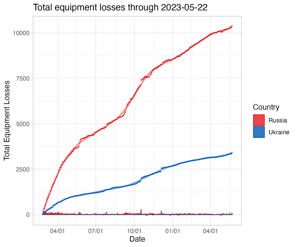
Points (red = Russia, blue = Ukraine) represent cumulative losses for each day, bars represent daily losses. The line represents a general additive model smooth on cumulative losses to date; the shaded grey band represents the 95% confidence interval based on extant variation (e.g. point scatter). A wider grey band means more uncertainty, a narrower grey band means less uncertainty.
Please keep in mind that this is empirical, not interpretive, analysis. A concern raised about the available data is that it undercounts Ukrainian losses. This is possible not just because of bias (note that pro-Russian sources are monitored as well) but because areas under Russian control are less likely to have photo documentation. Fog of war is very real. There is no attempt here to use a modifier to adjust numbers – analysis is strictly empirical. Any bias in the original data will be reflected in the following analyses.
Lastly, if you would like to make edits to descriptions of these data feel free to create a pull request or a new issue.